Wednesday, 10 November 2010

How is Star Image Used

Today I have looked at how important the image of the star is on a magazine cover in the means of promoting a film. This means, how influential is a picture of a big film star on the front of a magazine such as 'Total Film' when promoting a film. For example below you can see magazine covers, one with Megan Fox and one with Chris Pine.


Personally, I would say that Megan Fox is more widely known than Chris Pine. This means when people see her on the cover of a magazine they will be interested in what she has been involed in; less so to do with Chris Pine. However, this does not mean that they cannot be interested in a magazine with a relatively low key star on the front. People are attracted to these things in different ways. For example if a guy sees a good looking girl on a cover and he doesn't know her name, it wont stop him from being interested in the magazine.

Magazines tend to use either good looking people or very well known people on their covers. This is because if there is an actor that is relatively new to the screens and they are good looking then they can be placed on the front of the magazine as a 'New Talent' article promotion. If they are well known then people will see them on the cover and be interested in what their latest project is, regardless of how kind they are to the eye.

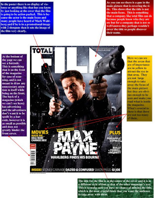
When we do our front cover I think that the most important thing that we need to focus on is getting the person to have the right facial expression to give across the mood that the film is trying to deliver. For example if the person is smiling but the film is a horror then the mood that you are delivering to your audience doesn't match the intentions of the film.


Here are 2 covers of Total Film magazine that display just how important setting the mood is.

This cover for inception is obviously a dark and serious film. It is helped by the effect on the title as it is complex looking and with the different shading on the title it adds to the depth of it. Using an actor that has previously done dark complicated projects adds to the mystery and interest.


This cover promoting 'Valkerie' shows a very well known actor with a very well known military suit, giving the audience an idea of what its about. Also it comes across as a very smart, crisp military film. This is helped by the title font being simple and clear.

Tuesday, 9 November 2010

Magazine Cover Analysis

Today I had a look at magazine covers. I looked at more than just one or two and got a good feel of them. Below is a cover that I analysed. It is of 'Total Film' which is a very well known and trusted media opinion.


Poster Recreation


Above is the original poster of Due Date which is a new box office hit movie come out across America and the U.K. I took this poster as my stimulus to create a new poster. This is a new comedy that features Robert Downing Jr. and Zach Galifianakis.


Above, this poster is the one I created through Photoshop by importing the original poster and cropping the pictures out. Then adding the photo on the other page I edited the boundries of the actors that didnt show the fine lines of the original. The Sky background i selected and used that as the framing device to put the picture on it. Then the titles were added to show that I have added my own style to the poster. I zoomed closer in to find the spaces that required a lot of work around the edges to slowly erase the fine lines of the previous picture.

Thursday, 4 November 2010

Titles Ideas.


Here above I spent todays lessons design a few title Ideas for our trailer, we still havent not come up with the name of our movie so we have called our work for now Title. With these experiments we can now pin point what sort of style we would want to have in our trailer. I used many different designing materials such as Outter Glow, Counter Lines, Inner Glow and Font styles to produce the perfect title. We created our title name just to show that this would be part of our main project towards the end of editing.

In the first few Titles we added different fonts to show a variety of styles one could use. Also the colour would show the feeling of the movie as it would portray the Genre of it. We have a scale of showing the genre of styles. Red and Bright colours being used mainly for comedies and Darker more harder colours to focus on the more serious aspects of trailers.
As our Genre revolves around Love and Comedy I would have to stick with a few bright colours and and a tint of red to make the focus of love more prominant. This is part of the research that goes into finding how to make the title look appealing to the audience. Not only does the shades of colour suite the way we put across the genre of the movie but also give a slight emotion to the title.
I will be loading a few more titles shortly in due course. For now these titles are the basic idea.


Wednesday, 3 November 2010

Conventions of a Film Poster

Alongside producing a front cover for a film magazine, another task that we have been set is to produce a film poster. Before actually starting this task I decided to research the codes and conventions of a film poster and this research is below.

*A eye catching title that can attract audiences attention, the choice of colours usually means it stands out from the background


* An intriguing photograph/picture well constructed into the composition of the poster that will attract audiences to the film


* Using the main characters (especially if they are well known) to attract the audiences attention and then can relate to other films they may have liked the actor in.


While making our film poster we have the disadvantage of not having well known actors' names to put on the poster to attract an audience, however we are able to fully fulfil the other points that I have mentioned.


Over the last century the film posters have developed over time thanks to new technology allowing different effects to be applied on them. Below are two examples of film posters, one from 1926 and another from 2004.


(Metropolis - 1926)


(Clash of the Titans 2010)


As you can see in the two images above the more recent poster has much more technical elements to it. For example there are the visual effects of the snake like creature on his arm and the debris in the air. Also the air has been done on a green screen to allow them to get the colour of sky that they wanted. Again this is a technique that we will be unable to replicate but there are posters that are just as successful yet the techniques are more doable.


This for example:


(The Italian Job - 2003)


Tuesday, 2 November 2010

Film Marketing Research

While looking at the promotional techniques that are used to spread the word of a new release, I chose to look at 'The Dilemma' because it is of the same genre as our project. I searched for an example of something that would tease the audience in to watching the trailer. This is the teaser that I found.


It is simple, doesn't give away much apart from when it's released and who is in it.
For this simple design to work the actors that are involved have to be well known for people to want to watch the trailer. For example if I made an exact copy of the poster, but changed the actors' names to Gregor Sharp and Vidur Bharatram then people would see that and not pay much attention to it because they don't trust the names enough to deliver the comedy that they want. Due to their success in that area of film in previous films people are drawn in and will go online and watch the trailer.

The colours in the poster make you take in all the necessary information. With the white background little information, it is difficult to miss anything on the poster. When you see the name you are already trying to think about what the dilemma could be to give the film that title and by having the release dates in a different colour the information is taken in.

Shot List

This afternoon we sat down and discussed all the shots that we need to make sure we capture in our film. This task took a lot of time and planning to ensure we got the best shots for the mood of the film etc. The chosen shots are below but in no particular order.

1) Split screen of rugby and football captain practising on their own.
2) Close up of rugby ball being kicked off a tee.
3) High angle of rugby pitch.
4) Rugby tackle as the captain is practising.
5) Upward tilt of captain after we see training shots.
6) Establishing shot of the football pitch (wide angle).
7) Close up of the football being kicked off the penalty spot.
8) Close up of the footballer's feet as he uses a specific trick.
9) Upward tilt of the football captain.
10) Mid shot of the girl's friends who are encouraging her to go and speak to the football captain.
11) Low angle shot of the girl walking towards the captains. (This will be done again in split screen so that we see her talking to both of them and being flirtatious)
12) Mid shot of her kissing the rugby captain in the woods.
13) Wide angle of her walking back to her house and meeting the footballer on the way.
14) Close up of the two of them kissing. (This is the same effect as having a split screen as it shows that she is playing the two characters without them knowing, without over using the split screen.)
15) Shot reaction shot of the two guys finding out that she is cheating on them.
16) Close up of fight starting when they go after each other.
17) Close up of hands as they make up and decide to go after her instead.
18) Boys walking towards her giving her a hard time.
19) Close up of her being treated badly in the lunch hall.
20) Add a caption after all the pranks " Until they Went too Far."

The reason that we have chosen to do a lot of the same shots for both captains is because we are hoping to use a split screen method to introduce the main characters to the audience. For example as the rugby ball is kicked off the tee the football will be kicked off the penalty spot at the same time. To ensure that this works we must film both the rugby and football scenes on the same day because we need the light to be same in both. This way we don't have one side of the screen darker than the other and so on.

By Vidur and Gregor