
* An intriguing photograph/picture well constructed into the composition of the poster that will attract audiences to the film
* Using the main characters (especially if they are well known) to attract the audiences attention and then can relate to other films they may have liked the actor in.
While making our film poster we have the disadvantage of not having well known actors' names to put on the poster to attract an audience, however we are able to fully fulfil the other points that I have mentioned.
Over the last century the film posters have developed over time thanks to new technology allowing different effects to be applied on them. Below are two examples of film posters, one from 1926 and another from 2004.

(Metropolis - 1926)

(Clash of the Titans 2010)
As you can see in the two images above the more recent poster has much more technical elements to it. For example there are the visual effects of the snake like creature on his arm and the debris in the air. Also the air has been done on a green screen to allow them to get the colour of sky that they wanted. Again this is a technique that we will be unable to replicate but there are posters that are just as successful yet the techniques are more doable.
This for example:
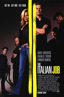
(The Italian Job - 2003)
No comments:
Post a Comment